Objective
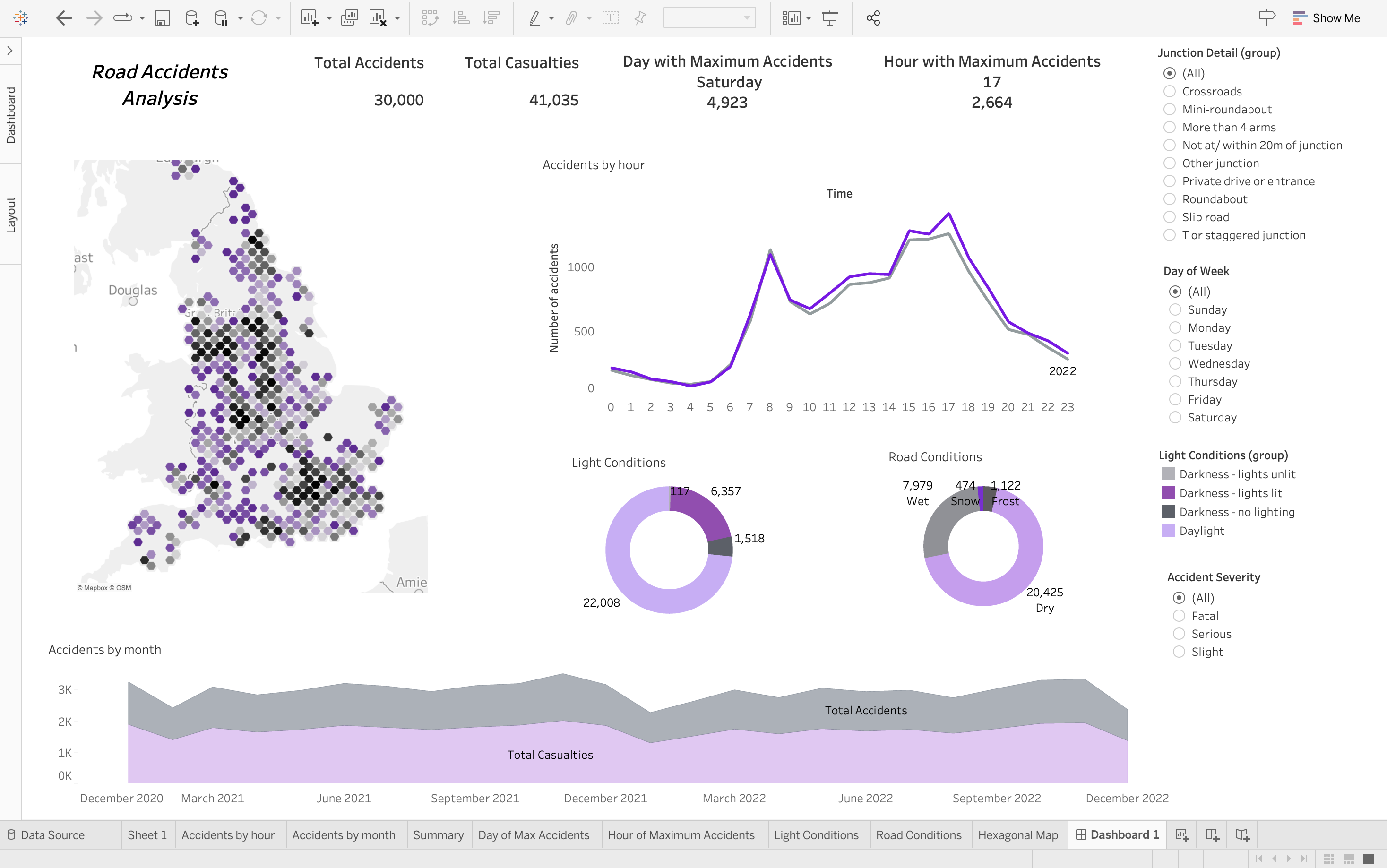
The objective of the Tableau Dashboard: Road Accidents Analysis project is to develop a comprehensive data visualization tool that provides insights into road accident trends, patterns, and contributing factors. By analyzing historical road accident data, the dashboard aims to identify high-risk areas, common causes of accidents, the time and weather conditions in which accidents occur and potential interventions to improve road safety.
Motivation
The motivation behind the Road Accidents Analysis Dashboard project stems from the pressing need to address road safety concerns and reduce the incidence of traffic accidents. Road accidents pose significant risks to public health, safety, and economic well-being, leading to injuries, fatalities, and property damage. By developing an interactive dashboard that visualizes and analyzes road accident data, stakeholders can gain a deeper understanding of the underlying factors contributing to accidents and prioritize interventions effectively.
Dataset: Road Accidents Dataset
The dataset contains information about road accidents in the UK. It consists of the date, day and time, location, light and weather conditions, number of casualties and the severity of accidents. It consists of 300,000 records. For easier analysis, 30% data is randomly selected.
Dashboard
The dashboard is designed to dynamically display accidents by hour, month, road conditions and light conditions based on the junction at which the accident occured, day of the week and the severity of accident. A hexbin map shows the ranked location of majority accidents.
Graphs and Insights
The dashboard depicts the following graphs:
-
Summary Table
This table summarizes the available data. It visualizes total number of accidents, total number of casualties, the hour of maximum accidents and the day of maximum accidents.

Insights:
- The total number of accidents is 30, 000.
- 30, 000 accidents led to 41, 035 casualties.
- The day with maximum accidents of 4932 is Saturday. This might be because there are more cars on the road during the weekend.
- Maximum accidents were observed at 17:00. This might be because office workers leave aroud that time whch leads to more traffic and accidents.
-
Location Hexbin Map
The hexbin map visualizes the location of accidents. Each hexagon represents a location where accidents occur. The sections are shaded to show which areas have the most accidents. Black Hexagons represent areas with maximum accidents.
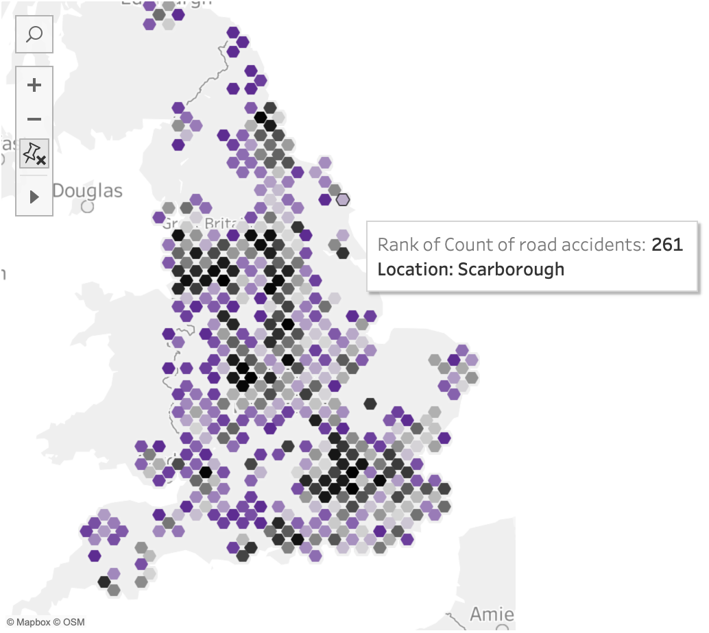
Insight: Most accidents occur in the northern and southern edges of UK.
-
Accidents By Hour
The “Accidents By Hour” graph displays the distribution of road accidents based on the time of day. It provides a visual representation of when accidents are most likely to occur throughout the day, allowing viewers to identify peak hours of accident occurrence and periods of relative safety. The two lines on the graph represent separate years - 2021 and 2022.
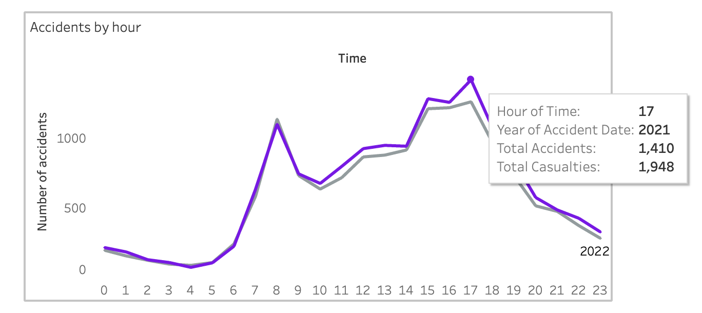
Insight: Maximum accidents are observed at 17:00. This observation is consistent across both years.
-
Accidents and Causalties by Month
This graph provides a visual representation of how the frequency of accidents and casualties varies throughout the year. The horizontal axis represents the months of the year, while the vertical axis represents the count of accidents and casualties.
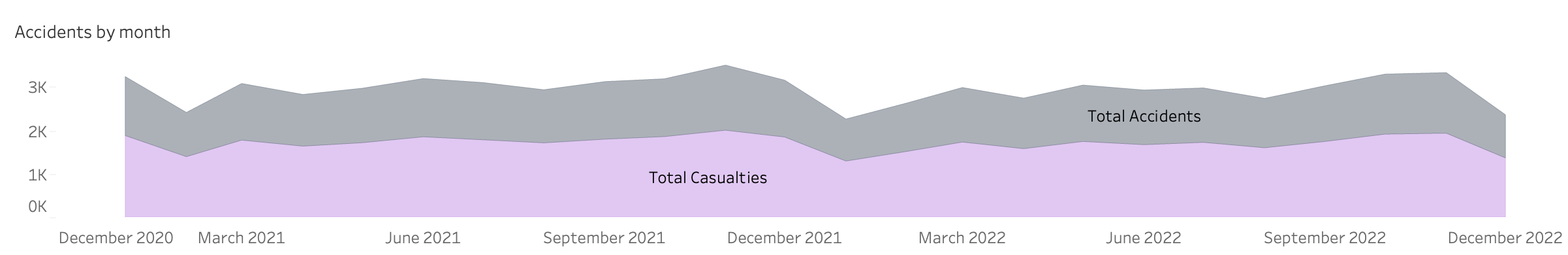
Insight: Maximum accidents are observed from October to December. This might be because there are a lot of festivals during this time and people travel a lot to meet their loved ones.
-
Accidents By Road Conditions
This donut chart provides a visual representation of the distribution of accidents based on different road conditions. In this chart, each segment of the donut represents a specific road condition category, such as dry, wet, frosty, or snowy roads. The size of each segment indicates the proportion of accidents attributed to that particular road condition. This visualization allows viewers to quickly grasp the relative frequency of accidents occurring under different road conditions.
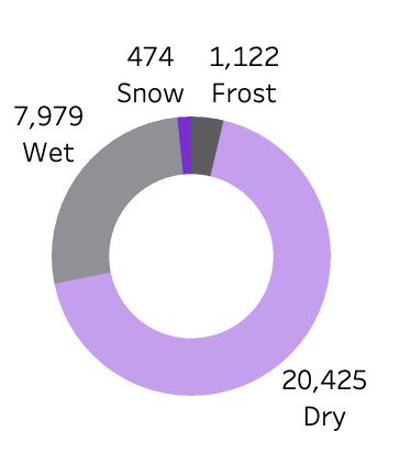
Insight: Maximum accidents occur when the roads are dry. This is because people avoid going out during wet, snowy and frosty road conditions.
-
Accidents By Light Conditions
The donut chart titled “Accidents By Light Conditions” provides a visual representation of the distribution of accidents based on different light conditions. The chart displays a circle divided into segments, each representing a specific light condition such as daylight, darkness with and without light. The size of each segment corresponds to the proportion of accidents occurring under that particular light condition.
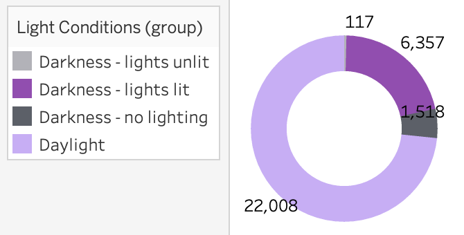
Insight: Maximum accidents occur when the daytime. This is because people avoid going out at night.